Friday, January 08, 2010
Friday, August 21, 2009
quick & easy photo editing tips!
hello old friends!
it's been awhile since my last post, hasn't it?
since last month we have enjoyed every last drop of our summer & have now started school again!
it's been awhile since my last post, hasn't it?
since last month we have enjoyed every last drop of our summer & have now started school again!
don't you think that went by way too fast? ;)
thank goodness i have all the photos i took of everything from vacations to everyday playtime, or else i probably wouldn't remember!i love taking pictures... editing them, on the other hand, is something i don't love!
i'm not super knowledgeable when it comes to adobe photoshop or any other elaborate editing program & i just don't have the time (or patience) to learn.
i'm sure a lot of you busy mommies feel the same way, and i get a lot of questions on how i edit my photos & get them to have that "vintage wash" effect with the rounded corners.
i use www.picnik.com and i absolutely love it... it's easy, fast & free!
i'm going to walk you through a few steps on which "actions" i use so you can see how easy it really is:
let's start with a regular photo:
 *go to the top of the page & click the "create" tab.
you will see all the actions on the left.
*scroll down until you see the "cross process" button.
*click & adjust the slider to your desired look. i usually slide it anywhere from about 45-75%.
*hit apply
your photo should look something like this:
 *now, find the "vignette" action (still to the left of the page) & click.
*slide your percentages to desired strength or leave as it is & hit apply.
*for this photo i used: size-50, strength-40%, & fade-20%.
this is what it looks like:
 *next, go back to the side actions & click on "1960's" button.
*adjust slider to desired look (i adjusted mine to 90%), hit apply
you should have something that looks like this:
 *now, for the final steps you can leave as it, or you can go to the "edit" tab on the top of the page & fade your colors a bit:
perfect!

*or, for a more "grainier" effect, go back to the "create" tab and choose the "cinemascope" action on the left. then uncheck the "letterbox my photo" square.
it should look like this:
it should look like this:

done!
do you see how easy it was...
do you see how easy it was...
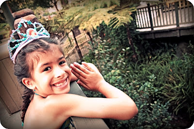
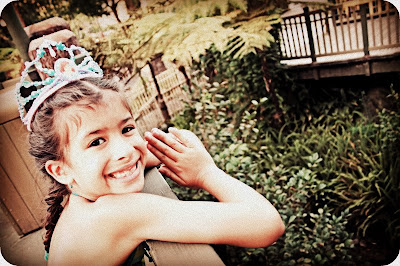
to go from this: to this:


some of my other favorite "actions" to use are "lomo-ish" (for more vibrant color) & also "orton-ish" (for a softer look).
there are lots of fun effects to try, and the more you get used to the format of the site, the easier & faster it will become.
have fun & experiment ;)
there are lots of fun effects to try, and the more you get used to the format of the site, the easier & faster it will become.
have fun & experiment ;)
i'm ready for the weekend, how about you?
Wednesday, July 15, 2009
if you're happy & you're...
i hope you're having a wonderful summer... we're getting ready to go to disney land soon!
do you have anything fun planned!
Friday, July 10, 2009
give away, give away!!!
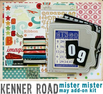
the mister mister:

do you want it want it?
can you believe that kenner road is giving away A TON of kits this weekend?!?!
each & every creative team member is giving away a separate kit, and all you have to do to is comment to win!!!
the more blogs you visit the more chances you get ;)
(see my links to the right)
so, just leave me a little comment & i will pick a winner on sunday night, 9pm PST.
ready?
steady?
GO!
steady?
GO!
Subscribe to:
Comments (Atom)
so cool! thanks for the chance to win!
July 11, 2009 9:45 PM
then you've won!
amy, please e-mail me at lisagaray@comcast (dot) net & i'll let kerry know so she can mail your kit to you asap! thanks everyone for playing!
did you guys see the reveal of the main kit?!: